"Global Warming" at a glance
|
|
JunkScience.com
Updated frequently.
UAH MSU | RSS MSU | NCDC | GISTEMP | Hadley CET | Armagh | Hadley CRUG | Radiosonde balloon | SIDC SSN | A word on scale | Source files
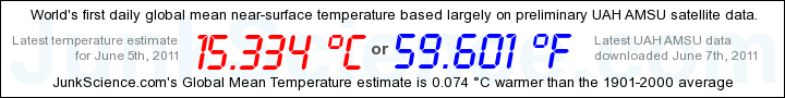
The world's temperature is a difficult metric to capture. After all, there is no convenient 'magical site' to sample that will give us the answer we seek
and, by the time we have sampled and collated sufficient data points to try to work it out, that isn't the temperature any more. We can, of course, sample
enough sites to garner an indication, as does our near real-time global thermometer at right NOTE THAT THE GLOBAL MEAN 'THERMOMETER'
HAS BEEN TERMINATED DUE TO CONTINUED ACCESS ISSUES WITH METAR -- SADLY MISSED. Read more... New daily
"thermometer" above the latest "official numbers". Click on the graphic or here
for the new daily mean temperature page and here for the
introduction.
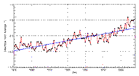
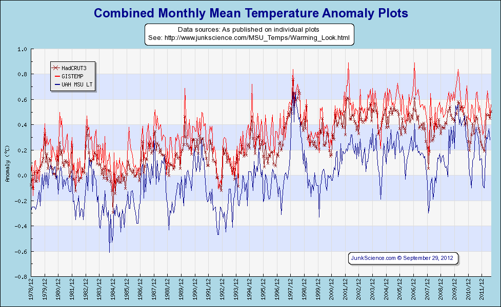 By request here
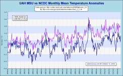
is the 'spaghetti plot' of multiple mainstream global temperature time series. We tend to find such plots too cluttered to be of great value but certainly this
demonstrates the increasing divergence between lower troposphere and near-surface plots (the two low series are UAH and RSS MSU series, in the 'middle' is the
combined Hadley Centre and UEA's Climatic Research Unit effort while the high series are GISTEMP and it's near-clone, NCDC). There has been some discussion
whether we should plot both GISTEMP and NCDC given the highly incestuous nature of the data and its processing but the bottom line is that all
near-surface time series rely on basically the same recording points and only the processing differs, if at all. Similarly, there is a very limited supply of
MSU tropospheric data available and only the processing differs there, too. In essence what we have are two near-surface series, the constantly up-revised
combined output of GISS and NCDC and the much less excitable joint effort by HadCRU, plus the tropospheric series derived using differing processing by UAH
& RSS but producing virtually identical results. One thing most seem to agree on is the abrupt warming spike caused by the 1997/98 El Niño event.
By request here
is the 'spaghetti plot' of multiple mainstream global temperature time series. We tend to find such plots too cluttered to be of great value but certainly this
demonstrates the increasing divergence between lower troposphere and near-surface plots (the two low series are UAH and RSS MSU series, in the 'middle' is the
combined Hadley Centre and UEA's Climatic Research Unit effort while the high series are GISTEMP and it's near-clone, NCDC). There has been some discussion
whether we should plot both GISTEMP and NCDC given the highly incestuous nature of the data and its processing but the bottom line is that all
near-surface time series rely on basically the same recording points and only the processing differs, if at all. Similarly, there is a very limited supply of
MSU tropospheric data available and only the processing differs there, too. In essence what we have are two near-surface series, the constantly up-revised
combined output of GISS and NCDC and the much less excitable joint effort by HadCRU, plus the tropospheric series derived using differing processing by UAH
& RSS but producing virtually identical results. One thing most seem to agree on is the abrupt warming spike caused by the 1997/98 El Niño event.
Update: A number of users have requested we omit NCDC and RSS since they essentially only clutter the plot without adding any useful information. We have agreed to do so.
We are often asked how much difference is made by the various average periods used to determine temperature anomalies, commonly 1961-90 and NCDC's 1880-2004. The answer is, not much. Looking at the Central England Temperature record averages for common benchmarks and whole of record shows little annual difference and the monthly averages basically composed of less-cold northern winter months (greatest variance October to January) with negligible change during the northern summer:
|
Central England Average Temperatures (°C) |
JAN |
FEB |
MAR |
APR |
MAY |
JUN |
JUL |
AUG |
SEP |
OCT |
NOV |
DEC |
Annual |
|
1961 to 1990 |
3.8 |
3.8 |
5.7 |
7.9 |
11.2 |
14.2 |
16.1 |
15.8 |
13.6 |
10.6 |
6.6 |
4.7 |
9.5 |
|
1880 to 2004 |
3.8 |
4.1 |
5.7 |
8.0 |
11.3 |
14.2 |
16.1 |
15.7 |
13.5 |
10.0 |
6.5 |
4.5 |
9.5 |
|
1659 to 2005 |
3.2 |
3.8 |
5.3 |
7.9 |
11.2 |
14.3 |
16.0 |
15.6 |
13.3 |
9.7 |
6.0 |
4.1 |
9.2 |
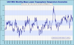
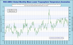
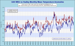
UAH MSU:
For familiarity's sake: We begin with the UAH MSU Global Monthly Mean Anomaly graphic:
TAKE NOTE: From Update 13 Sep 2010 *************************
As an alert, we will be generating anomalies when the December data have been processed to be based on the 30-year mean annual cycle of 1981-2010 to
match the 30-year normal time frame of many meteorology anomalies. This will replace the older reference annual cycle of 20-years (1979-1998).
From Update 8 Dec 2010 *************************
Preliminary runs show that the new mean annual cycle will be about 0.1 C warmer each month for the global averages, meaning all monthly anomalies will appear
to decrease by about 0.1 when the new 30-year base period is used (see below).
... End update
Information from Global Hydrology and Climate Center, University of Alabama - Huntsville, USA The data from which the graphs are derived can be downloaded here.
 UAH
Global Temperature Report for the current month (The University of Alabama in Huntsville) UAH
Global Temperature Report for the current month (The University of Alabama in Huntsville)
Global Temperature Report 1978 - 2003 (PDF), Dr. John Christy & Dr. Roy Spencer, Earth System Science Center, University of Alabama in Huntsville |
|||
|
Always popular are the regional and hemispheric splits - these still from UAH:
|
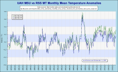
Here are the mid troposphere graphics
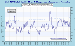 UAH MSU mid troposphere data do not vary significantly from the lower
troposphere set. UAH MSU mid troposphere data do not vary significantly from the lower
troposphere set.
These are provided solely because Remote Sensing Systems are highly erratic with regard to making their lower troposphere data available and a number of site users specifically wish to compare UAH & RSS MSU data. |
|||
|
As usual, the splits are provided in the same regions as the lower troposphere data:
|
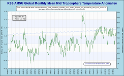
RSS MSU:
Data from Remote Sensing Systems: As of November 2008, which means data for October onwards, RSS_Monthly_MSU_AMSU_Channel_TLT_Anomalies_Land_and_Ocean_v03_2.txt (Graphics will progressively update to reflect this change)
Update November 2008: Changes from RSS TLT Version 3.1 to Version 3.2 (pdf); Changes from RSS Version 3.0 to RSS Version 3.2 (pdf)
Update Jan 24, 2008: RSS TLT change in response to discrete error notice: January 16,
2008
We discovered an error in our processing of AMSU data from NOAA-15 for TLT. A new version, version 3.1 is now available and should be used for all applications.
This new version
is in much better agreement with other sources of tropospheric temperature. We apologize for any inconvenience.
What was the error?
Last January, I made a small change in the way TLT is calculated that reduced the absolute Temperatures by 0.1K. But I only used the new method for 2007 (the
error). When the data are merged with MSU, MSU and AMSU are forced to be as close as possible to each other over the 1999-2004 period of overlap. This caused
the error to show up as a downward jump in January 2007. To fix the problem, I reprocessed the 1998-2006 AMSU data using the new code (like I should have done
in the first place), and merged it with the MSU data.
We would like to thank John Christy and Roy Spencer, who were very helpful during the diagnosis process.
Carl Mears, RSS, January 16 2008
|
|
|
|||
|
Here are the regional and hemispheric splits - this time from RSS -- note there is some variation between latitude bounds between these and UAH data, which we are checking for you. Consequently there is some variation particularly stemming from RSS truncation of the southern hemisphere (data covers 85N-70S):
|
||||
Data for mid troposphere: rss_monthly_msu_amsu_channel_tmt_anomalies_land_and_ocean_v03_0.txt
|
|
|
|||
|
Again, note there is some variation between latitude bounds between these and UAH data, yet to be clarified and the usual disagreement regarding the 'proper' altitude band to sense. There is also variation between these and the lower troposphere data from the same source with this data covering 82.5N-82.5S (go figure!):
|
||||
Global lower stratospheric and lower tropospheric temperature anomalies from satellites and radiosondesHadley Centre graphic, updated irregularly. |
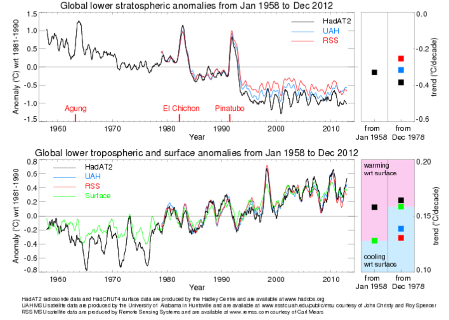 |
MSU equivalent global mean timeseries plot (K)Hadley Centre graphic, updated near-realtime.
Please note that Hadley graphics are subject to Crown Copyright. Their availability is entirely at the discretion of the owning entity. |
 |
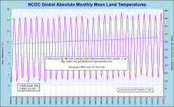
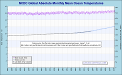
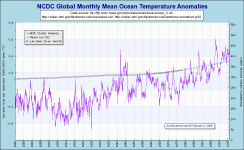
NCDC:
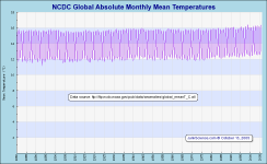
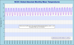
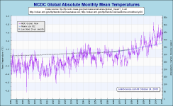
That's all very well but most people relate to the absolute temperature and many users are by now possibly pounding on the keyboard: "Never mind the variance! What's the blasted temperature?" Fortunately, the brave souls at the National Climatic Data Center have taken a stab at producing just that:
IMPORTANT NOTE May 16, 2008: It has been brought to our attention that NCDC have switched mean base periods from 1961-90 to 1901-2000. This has no effect on absolute temperature time series with the exception of land based temperatures. The new mean temperature base is unchanged other than land based mean temperatures for December, January and February (the northern hemisphere winter), with each of these months having their historical mean raise 0.1 K.
At this time raising northern winter land based temperatures has not altered published combined annual means but we anticipate this will change and the world will get warmer again (at least on paper, which appears to be about the only place that is true).
We will reprocess all affected files and graphics as soon as possible to comply with this table:
Global Mean Monthly Surface Temperature Estimates for the Base Period 1901 to 2000
| Land Surface Mean Temp. |
J |
F |
M |
A |
M |
J |
J |
A |
S |
O |
N |
D |
Annual |
|---|---|---|---|---|---|---|---|---|---|---|---|---|---|
| 1901 to 2000 (°C) |
2.8 |
3.2 |
5.0 |
8.1 |
11.1 |
13.3 |
14.3 |
13.8 |
12.0 |
9.3 |
5.9 |
3.7 |
8.5 |
| 1901 to 2000 (°F) |
37.0 |
37.8 |
40.8 |
46.5 |
52.0 |
55.9 |
57.8 |
56.9 |
53.6 |
48.7 |
42.6 |
38.7 |
47.3 |
| Sea Surface Mean Temp. |
J |
F |
M |
A |
M |
J |
J |
A |
S |
O |
N |
D |
Annual |
| 1901 to 2000 (°C) |
15.8 |
15.9 |
15.9 |
16.0 |
16.3 |
16.4 |
16.4 |
16.4 |
16.2 |
15.9 |
15.8 |
15.7 |
16.1 |
| 1901 to 2000 (°F) |
60.5 |
60.6 |
60.7 |
60.9 |
61.3 |
61.5 |
61.5 |
61.4 |
61.1 |
60.6 |
60.4 |
60.4 |
60.9 |
| Combined Mean Surface Temp. |
J |
F |
M |
A |
M |
J |
J |
A |
S |
O |
N |
D |
Annual |
| 1901 to 2000 (°C) |
12.0 |
12.1 |
12.7 |
13.7 |
14.8 |
15.5 |
15.8 |
15.6 |
15.0 |
14.0 |
12.9 |
12.2 |
13.9 |
| 1901 to 2000 (°F) |
53.6 |
53.9 |
54.9 |
56.7 |
58.6 |
59.9 |
60.4 |
60.1 |
59.0 |
57.1 |
55.2 |
54.0 |
57.0 |
END
*In February, 2006 NCDC transitioned to the use of an improved Global Land and Ocean data set (Smith and Reynolds analysis (2005)) which incorporates new algorithms that better account for factors such as changes in spatial coverage and evolving observing methods. (See NCDC Global Surface Temperature Anomalies) The same file states "The global monthly surface temperature averages in the table below can be added to a given month's anomaly (departure from the 1880 to 2004 base period average) to obtain an absolute estimate of surface temperature for that month." Which is precisely what we are doing with the global combined, global land and global ocean anomalies to derive the following, revised global absolute temperatures.
Note from NCDC: *From February 2006 through April 14, 2006, the anomalies provided from the links below were inadvertently provided as departures from the 1961-1990 average. Anomalies are now provided as departures from the 20th century average (1901-2000).
|
|
Latest Month in Historical Perspective (National Climatic Data Center)
Note that the following table differs from NCDC's "Global Mean Monthly Surface Temperature Estimates" published here because those numbers are for the Base Period 1880 to 2004. We realise having everyone declare anomalies with reference to different base-periods is frustrating and we try to maintain at least similar base reference periods for data used in the graphs. Where discrepancies are observed in reported anomalies check the reference period.
UPDATE February 12, 2006: Curiously, the revised monthly means for 1961-90 are exactly the same as those published for 1880-2004, though somehow we doubt that will lead to a rash of headlines stating that the world is really kind of average, temperature-wise.
|
NCDC's Revised Monthly Averages 1961-1990 (°C) |
|||||||||||
| Jan | Feb | Mar | Apr | May | Jun | Jul | Aug | Sep | Oct | Nov | Dec |
| 12.0 | 12.1 | 12.7 | 13.7 | 14.8 | 15.5 | 15.8 | 15.6 | 15.0 | 14.0 | 12.9 | 12.2 |
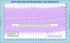
Here's the same array for land temperatures:
 |
 |
and ocean temperatures:
 |
 |
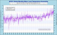
Of course, NCDC also report in the more accustomed anomaly format:
|
|
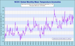
|
|
| Despite their prodigious effort, for which they have our thanks and admiration, NCDC are still producing near-surface temperature amalgams, which we view with some suspicion. Not because of anything NCDC are or are not doing, after all, they are simply providing the service people demand and doing so to the best of their ability, merely because near-surface amalgams are subject to so many potentially corrupting influences. For example, recording points may be established at the edge of town and over time be surrounded by multi-story buildings and paved roads - it's progress and who's to complain but it does add significant local warming bias to many records over time. For this reason we compare near-surface anomalies with those suggested but the satellite-mounted MSUs. | ||
NCDC's reported anomaly should agree with these figures (from their web page).
|
Combined Mean Surface Temp. |
JAN |
FEB |
MAR |
APR |
MAY |
JUN |
JUL |
AUG |
SEP |
OCT |
NOV |
DEC |
Annual |
|
1880 to 2004 (°C) |
12.0 |
12.1 |
12.7 |
13.7 |
14.8 |
15.5 |
15.8 |
15.6 |
15.0 |
14.0 |
12.9 |
12.2 |
13.9 |
|
1880 to 2004 (°F) |
53.6 |
53.9 |
54.9 |
56.7 |
58.6 |
59.9 |
60.4 |
60.1 |
59.0 |
57.1 |
55.2 |
54.0 |
57.0 |
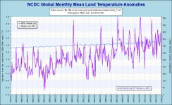
Here's the land anomalies:
 |
 |
 |
 |
GCAG Time Series & Trends
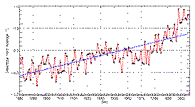 One of the common
requests received here at JunkScience.com is for information on global temperature trends. Specifically, people seem to want to be able to compare land-based
temperature trends with global, probably in an attempt to identify unadjusted urban heat contamination of the data. These from NCDC:
One of the common
requests received here at JunkScience.com is for information on global temperature trends. Specifically, people seem to want to be able to compare land-based
temperature trends with global, probably in an attempt to identify unadjusted urban heat contamination of the data. These from NCDC:
Time series: Temperature January-December, 1880 - 2005
GHCN
Land Surface Data Set -- Global Trend: 0.07°C/decade
The land-based trend is 75% greater than land + sea surface trend and 40% greater than the Hadley-CRU cooperative merged land and sea surface trend.
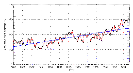
 [Left] Time series:
Temperature January-December, 1880 - 2005
[Left] Time series:
Temperature January-December, 1880 - 2005
GHCN-ERSST
Data Set
Global Trend: 0.04°C/decade
[Right] Time series: Temperature January-December , 1870 - 2005
HadCRUT2v
Data Set
Global Trend: 0.05°C/decade
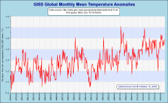
GISTEMP:
This brings us to the hottest of records. Not that we think the Goddard Institute for Space Studies team are particularly good at establishing global temperature or anomalies, at least no better than other industrious teams attempting to do the same thing, it's just that GISS's GISTEMP is consistently delivering the warmest anomalies and accelerating away from the pack (well it is the house of Hansen, so-called "father of global warming" ...).
September 2006: from the next available update GISTEMP + dSST will be the source for these graphics -- this might help to reduce the apparent disparity between datasets.
GISS Surface Temperature Analysis: Global Temperature Trends: 2005 Summation
|
|
Best estimate for absolute global mean for 1951-1980 is 14 °C (57.2 °F)
Goddard are nice enough to provide a number of annual splits by latitude on their data:
| Global Northern Hemisphere Southern Hemisphere 24S-24N (Tropics) |
EQU-24N 24N-90N 24N-44N 44N-64N 64N-90N (Arctic) |
24S-EQU 90S-24S 44S-24S 64S-44S 90S-64S (Antarctic) |
 Dataset
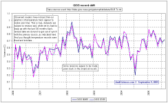
Creep: As some of our more observant readers have noticed, the derived mean temperature for any given month is subject to change, with revision of derived
temperature values possible, even likely, years after publication.
Dataset
Creep: As some of our more observant readers have noticed, the derived mean temperature for any given month is subject to change, with revision of derived
temperature values possible, even likely, years after publication.
While such dataset creep makes little difference in the grand scheme of things it does disturb some people's confidence in both the datasets and the displayed graphics. This is unfortunate although we can understand it when anomalies are given to three decimal precision and then adjusted tenths of a degree after the fact, so to speak.
Why does it happen? Usually because delayed or absent station reports become available, some of which appear to have significant effect on apparent anomalies. Does it matter much? Not really, it just adds to the little we currently know of our planet and its temperature trends. We do not know with any precision what the actual mean temperature of the planet is at any given time and most of the figures given here are various guesstimations of the 'anomaly' (variation from estimated mean for the time of year over some period of the very recent past, commonly 1951-1980 but not always).
Sadly, such constant revision does not make it any easier to counter allegations that simply talking about 'global warming' is making recent decades hotter.
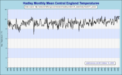
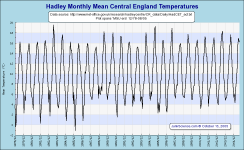
Hadley CET:
|
|
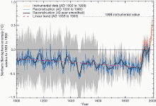
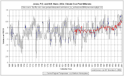 It
occurs to us that the Central England Temperature set makes a good proxy for the northern hemisphere and examination of the plot drawn from Jones, P.D. and M.E.
Mann. 2004. Climate Over Past Millennia suggest
this is indeed the case. The Central England set suggests the northern hemisphere reached contemporary references temperatures in the 1940s (as shown by the NH
HadCRUT2v track used by Jones and Mann) and likely did so in the 1830s and 1720s as well. Why do we mention this? Well, it certainly appears startlingly at odds
with a rather more notorious northern hemisphere temperature graphic, doesn't it?
It
occurs to us that the Central England Temperature set makes a good proxy for the northern hemisphere and examination of the plot drawn from Jones, P.D. and M.E.
Mann. 2004. Climate Over Past Millennia suggest
this is indeed the case. The Central England set suggests the northern hemisphere reached contemporary references temperatures in the 1940s (as shown by the NH
HadCRUT2v track used by Jones and Mann) and likely did so in the 1830s and 1720s as well. Why do we mention this? Well, it certainly appears startlingly at odds
with a rather more notorious northern hemisphere temperature graphic, doesn't it?
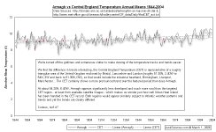
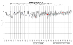
Whether the CET with its focus on the industrial heartland of England has been adequately adjusted for Urban Heat Island as claimed is a question frequently asked of us. The short answer is, of course, we don't know. This is something of a black box and the only one who can tell us, Phil Jones, has been rather reluctant to share raw data and methodology. Consequently it is necessary to second guess the situation and the only help we can find is the long-term air temperature series from Armagh Observatory, Northern Ireland. Below we have the Armagh Max, Min and Mean annual temperatures and the annual mean plotted with the CET absolute mean temperatures for the corresponding period.
 February 2006:
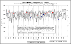
Drought in England: Interesting that the drought of note (1976) should have occurred at the end of the period of cooling that caused such global angst.
Let's have a look at this before the, uh, deluge of claims of 'global warming'-induced drought.
February 2006:
Drought in England: Interesting that the drought of note (1976) should have occurred at the end of the period of cooling that caused such global angst.
Let's have a look at this before the, uh, deluge of claims of 'global warming'-induced drought.
The England and Wales Precipitation data is available online here. Those who like to check under the hood and kick the tires will find a tiny increase in precipitation over the 240-year record, with an interesting smoothing of precipitation through the year - that is, there's been a little more rain in the drier December through May half and a little less in the soggier June through November half of the year. Sounds like good news for water managers in England and Wales.
Armagh Observatory air temperature data
Armagh Observatory (lat. 54°21.2'N; long. 6°38.9'W) lies approximately 1 km northeast of the centre of the ancient city of Armagh. It is situated 64 m
above mean sea level at the top of a small drumlin (hill) in an estate of natural woodland and parkland of circa 7 ha. To the north and east the observatory’s
estate is bounded by meadow, and from the southeast to the southwest by school playing fields and a town park known as ‘The Mall’. Thus, the observatory is
still largely surrounded by countryside similar to that which has existed since its foundation in 1790. Together with the fact that the population of Armagh
when compared with other Irish and UK cities has increased relatively little since the late 18th and early 19th centuries (population 1816: 7,000; 1911: 7,600;
1991: 14,265), its rural environment has ensured that the observatory suffers from little or no urban micro-climatic effects (see Coughlin and Butler (1998)).
In addition, with a relatively exposed site, in a fairly windy maritime climate, any urban climatic effects that did exist would be expected to be minimized. --
Butler et al (Int. J. Climatol. 25: 1055–1079 (2005))
| Papers describing the data in the adjacent graphs and its calibration are available for download
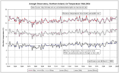
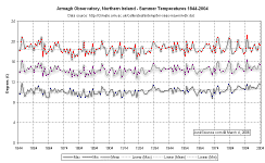
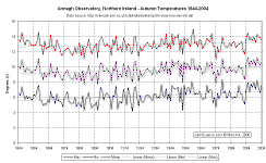
from this page. We have plotted: Mean seasonal maximum, minimum temperature Mean annual maximum, minimum temperature Also available are: |
|
|
| As can be seen in the adjacent pair of graphics there is virtually no trend in Armagh Summer or Winter maximum temperatures and a very small 'less colding' trend in minimum temperatures. | 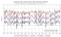
|
|
| Spring and Autumn in Armagh would appear to have softened somewhat with Summer lingering a little longer and perhaps Winter departing a tad earlier. More 'less colding' is evident than increase in maximum temperatures. | 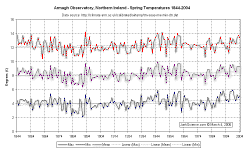
|
|
Readers should note that there is a longer, combined record for Armagh extending the record back to 1796, which we have been granted permission to publish
here. One important feature of the longer series is that temperatures pre-1825 average -0.75 °C cooler than the Central England Temperature, although from
1840-2004 the difference averages a much smaller -0.23 °C. The effect of this pre-1825 divergence in the records is that the longer Armagh series has a
trend of +0.057 °C/decade compared with the 1844-2004 trend of +0.036 °C/decade. Again we remind everyone that trends are heavily dependent on
selection of origin and listed anomalies depend on reference period - always check for data compatibility before comparing.
| From Air Temperatures At Armagh Observatory, Northern Ireland, From 1796 To 2002: Long-term trends are seen in both seasonal and annual mean temperatures, with spring and summer series relatively flat compared with autumn and winter. Prior to 1820 we note that autumns and winters were cooler by ~1 °C. Later, we note a significant warming in the mid-19th century, which started in the late 1820s and continued till c. 1870. A cool interval at the end of the 19th century was followed by a period of rising mean temperatures that lasted till the mid-20th century. Finally, a slight cooling from 1960 to 1980 was followed by a gradual warming over the past two decades. In spite of the current warmer conditions, annual mean temperatures still remain within the range seen in the previous two centuries. | 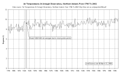
|
|
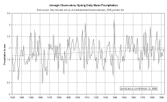
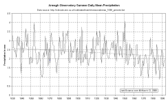
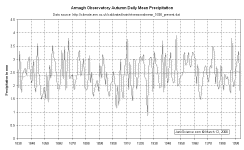
In addition to air temperature data we have Armagh Observatory rainfall data.
| From Precipitation at Armagh Observatory 1838-1997: "We note a roughly constant upward trend, with a slope of +0.0039 ±0.001mm/day/yr, in annual precipitation from the beginning of the series until approximately 1960. The only really significant departure from this trend is the dip in rainfall around 1890 close to, but possibly a little later than, a dip in mean air temperature. The generally upward trend in both mean air temperature and rainfall over the period 1890–1950 could be explained by the increased evaporation rate over the Atlantic as air temperature rises. A similar explanation would presumably be viable for the dip in temperature and precipitation around 1890. Between 1850 and 1880 the approximate correspondence between precipitation and temperature breaks down, with temperature around 1850 higher and rainfall lower than average. After 1970 the precipitation drops significantly and thereafter remains roughly at the level recorded at the beginning of the series." | 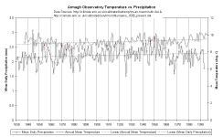
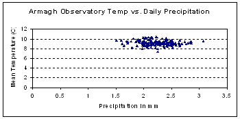
The correlation between temperature and daily mean precipitation would appear rather poor.
|
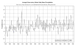
There is a noticeable change in winter precipitation with winter rainfall increasing through the 19th Century portion of the record, then remaining largely constant through the 20th Century despite a rise and fall in the first half. It is particularly remarkable that rainfall driven by the Westerly Maritime Stream from the Atlantic has not risen markedly since the 1970s despite the belief global warming has been dramatic during this period and the expectation of increased oceanic evaporation and associated precipitation that should accompany such warming. |
|
|
|
Armagh Observatory are progressively making more data available accessible from here and we will plot more in due course. Meanwhile, those concerned 'global warming' is increasing storminess might like to access The Storminess Record From Armagh Observatory, Northern Ireland, 1796-2002 (here for the .pdf version). For the impatient, here are their conclusions:
Very significant variations in storminess have been recorded over the last 200 years for Armagh observatory despite the sheltered inland nature of the site. This includes evidence for increased storminess at the end of the Little Ice Age. However, there is no evidence of increased storminess over the last 30 years. When similar records from other Irish stations are examined, there is some evidence of a possible northwards movement of the storm tracks that have affected the island of Ireland over the last 30 years.
So, that little lot should have Earth's temperature sorted eh? Actually not. There are many ways of trying to determine the planet's temperature, although the efficacy of such a metric has yet to be established.
So far we've had a look at a few global and regional splits but there are others. Take, for example, those available from HadleyCRUG, a collaboration between the UK Met Office Hadley Centre and the Climatic Research Unit - similar to but not the same as either.
Following we have a few dozen more ways of looking at the planet's temperature.
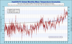
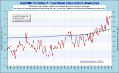
Hadley CRUT3:
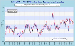
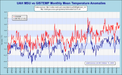
As usual, we provide the "satellite era" monthly track and a comparison with UAH MSU data:
|
|
|
|
Just before we leave you with this fascinating array of measures, and fascinating they must be because people have discussed weather and ambient temperature for time immemorial, might we just pose the questions: what is the 'correct' temperature and what difference does it really make? After all, we have always made the best of whatever the temperature happens to be - and so we always will. 'Soft' weather is a novelty we have always enjoyed and adverse events something we have always endured - so what's new? |
|
|
Whatever, here's a selection of metrics from HadCRUT2 -- series no longer continued in this format from end 2005, left for those who like to refer back to previous versions. Some regional splits are available in HadCRUT3 -- see this page.
Radiosonde balloon:
Annual Global Temperature Deviations in the Troposphere and Low Stratosphere, 1958 - 2004
February 2005
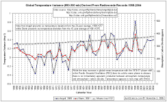 Source: J.
K. Angell
Source: J.
K. Angell
Air Resources Laboratory
National Oceanic and Atmospheric Administration
Deviation of yearly temperature from the 20-year average, 1958-1977
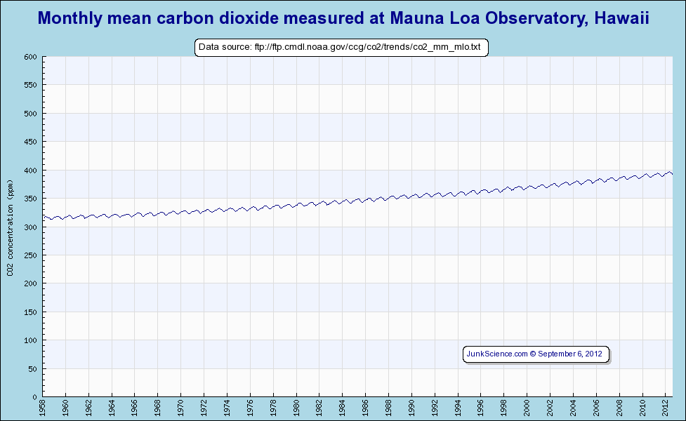
Annual and Seasonal Global Temperature Deviations of the Troposphere and Lower Stratosphere This will vary slightly against the global mean sea level figure but, with such a well-mixed trace gas, the differences are trivial. Original source. PLEASE NOTE: These time series graphics are produced with first publication of the month's data from MLO, which is provisional and regularly altered
in retrospect. It is common for adjustments to be made throughout the series without notice. These graphics therefore are only certified correct with the data
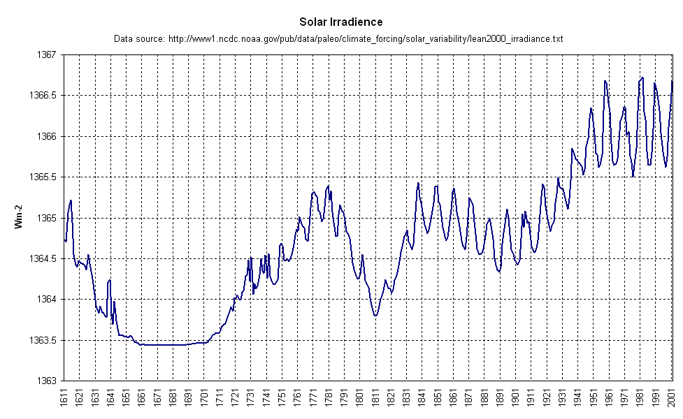
available at first change capture in the month and values may change ± 2 ppmv (sometimes more) in subsequent renderings. ABSTRACT (Lean 2000): Because of the dependence of the Sun's irradiance on solar activity, reductions from
contemporary levels are expected during the seventeenth century Maunder Minimum. New reconstructions of spectral irradiance are developed since 1600 with
absolute scales traceable to space-based observations. The long-term variations track the envelope of group sunspot numbers and have amplitudes consistent with
the range of Ca II brightness in Sun-like stars. Estimated increases since 1675 are 0.7%, 0.2% and 0.07% in broad ultraviolet, visible/near infrared and
infrared spectral bands, with a total irradiance increase of 0.2%.
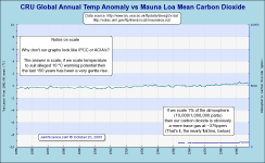
Questions have been asked about why our graphics look so very different from those frequently seen in the media and IPCC
and ACIA publications. Apart from the obvious differences stemming from our not using flash graphics software, pretty
pictures and 3D dinguses there is one significant variation - scale. I could launch into longwinded explanations but it is probably easier and more effective
simply to demonstrate. The graphs linked from the following thumbnails are all generated with identical data:
There you have it, each graph produced from the best available data (the same data) but all visually distinctive.
The first candidate, although lacking the amplitude to allow easy detail examination, is perhaps the most visually accurate and least useful. Clearly global
temperature has been on an overall warming trend through the series and this warming is very small compared with say, seasonal variation. Likewise, the two
order of magnitude magnification of carbon dioxide (by scaling parts per million on a 10K range) has made our trace gas visible while maintaining perspective
(two times a tiny fraction of the atmosphere still gives you a tiny fraction of the atmosphere).
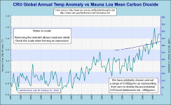
Our next graphic is a mixed bag, rather restrained in the temperature variation when compared with most publications but sufficient to readily observe
variation. The representation of rapidly climbing carbon dioxide is achieved by scaling against only a tiny portion of the valid range. ACIA, in this graphic, manage to present virtually a perpendicular change which gives the impression of
being about 500% over 'background' levels and fitted neatly to a representation of the infamous 'hockey stick' graph when in fact the total change in
atmospheric carbon dioxide is under 35%. Oh well, that's the impression they want to give, we suppose, although we think it an appalling piece of chart work.
Finally, our third chart depicts unrestrained temperature variation, utilising maximum plot space in order to easily depict temperature changes (albeit
vastly magnified) and with a greatly magnified but proportionately correct trace gas representation (316-377ppmv annual CO2 (Keeling and Whorf, May,
2005), missing values omitted). This is our preferred graphic and the style we present. Granted, it greatly amplifies apparent temperature change and, if this
worries readers just visualise the world as a relatively flat 14 °C ± 0.7 °C and you'll be in the ballpark.
Copyright © 2004-2011 JunkScience.com - All Rights Reserved.
This article, including graphics, may be reprinted in full or in part with attribution.
June 2001
Source: A.M. Sterin
Russian Research Institute for Hydrometeorological Information-World Data Center (RIHMI-WDC).
Annual temperature deviation from the 15 year average of 1961-1975.
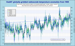
HadAT2:
Monthly mean carbon dioxide, Mauna Loa Observatory, Hawaii
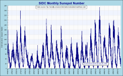
SIDC International Sunspot Number:
Solar Irradiance Reconstruction
A word on scale:
