|
|
We've been looking at global mean temperature records of the lower troposphere derived from NOAA satellite-mounted MSUs - in case anyone's forgotten, they look like this:
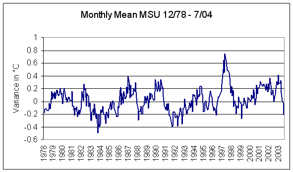
There's one outstanding feature on this graph - the obvious response to the powerful 1997/98 El Niño event. Latest available global mean temperature anomaly was July, 2004 of -0.213 °C. The El Niño temperature spike really stands out on the annual mean temperature anomaly graph for the lower troposphere, which looks like this:
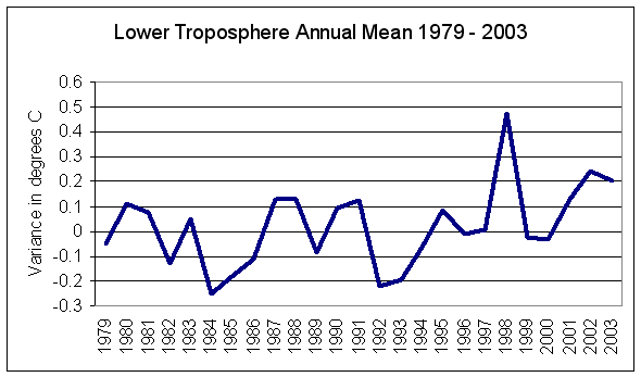
This graph also makes obvious why claims of the 1990s being the hottest decade in the last thousand years are treated with such derision - 1998 was extraordinary but the 1990s were very ordinary with a 1991-2000 average of just +0.014 (zero-masking 1998 gives a result of -0.033). One other notable: alleged atmospheric "thermal inertia" is negligible and the event-response warming (and subsequent cooling) occurred within months, not decades as model-excusers would have us believe.
So, on to our quiz.
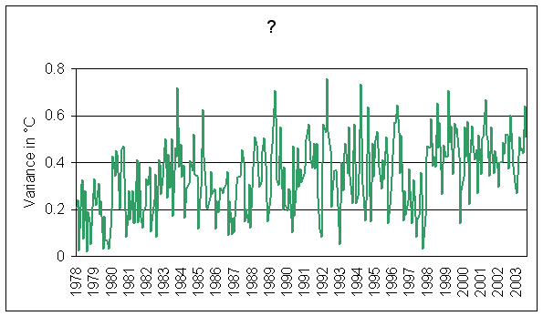
On the same timeframe as the above, what do the following graphs represent? Here's a monthly mean temperature track:
and here's the annual:
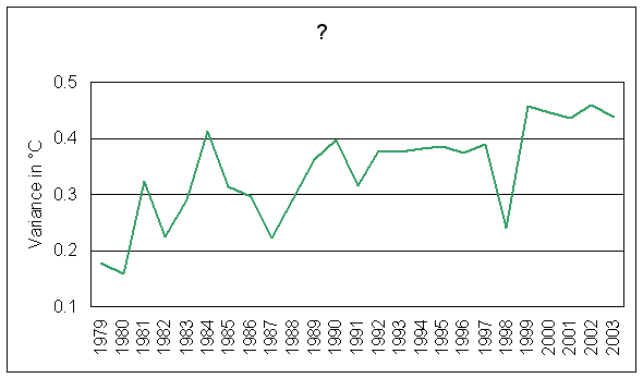
Note how useless graphs can be, even when timescales and temperature variance are provided. Without proper reference and without knowing precisely what they represent we are at something of a loss. So, a few clues:
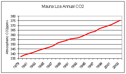
We're remaining within the surface-lower troposphere zone here, there are no scale tricks involved, no inversions and we're specifically dealing with temperature anomalies (big clue considering "Variance in °C" is our value axis label) so there's no need to wonder about atmospheric CO2 levels - remember that graph looked like this:
Hmm... definitely temperature and definitely in the zone we've covered before - but don't look familiar. Certainly the values increase over time and we know that they have something to do with the lower-troposphere graphs we've seen before, some even being reproduced here. Values getting bigger, lower troposphere temperature anomaly charts, same timeframe as the MSU record... must demonstrate enhanced greenhouse warming somehow, right? But how? They don't look the same and there's no scale tricks...
Copyright © 2004 JunkScience.com - All Rights Reserved.