|
|
What? Given up so soon?
Well, there wasn't really a whole lot to go on with a few untitled graphs so let's fill in the missing information:
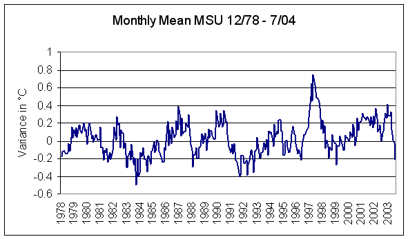
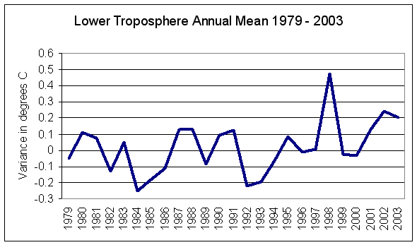
Firstly, we saw the MSU Lower Troposphere anomalies - monthly and annual and then these:
So what's the relationship? As usual, information is missing from the picture - information critical to fully evaluating the situation.
We digress here, just a little, because understanding where our puzzle parts fit is essential to understanding the larger question.
We told you in the JunkScience.com feature The Atmosphere and Enhanced Greenhouse - What's Going On?, that there are multiple datasets in use by varied investigators trying to evaluate the Earth's mean temperature trend(s). We provided links to the MSU digital data used to generate the Lower Troposphere temperature anomaly graphs linked above and also to GHCC items on MSUs and the mutual validation of radio-sonde balloon data with that derived from these "thermometers in space." That so-diversely derived datasets are mutually validating inspires some confidence in their veracity. That MSUs cover such a large proportion of the globe and do so in the well-mixed atmosphere rather than immediately adjacent to confounding influences merely increases that confidence.
There are, however, other datasets derived by the amalgamation of near-surface thermometer temperature readings. One clung to by enhanced greenhouse enthusiasts is the NASA GISS surface temperature analysis (GISTEMP), referred to here as GISS. Some attempt to adjust for Urban Heat Island Effect (UHIE) is made within this set but nasty skeptics like JunkScience.com believe this adjustment to be woefully inadequate. For an easily-digestible take on why we are less than enamored with the near-surface temperature amalgams see Report to the Greening Earth Society "The Surface Record: ‘Global Mean Temperature’ and how it is determined at surface level" by John L. Daly.
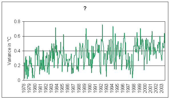
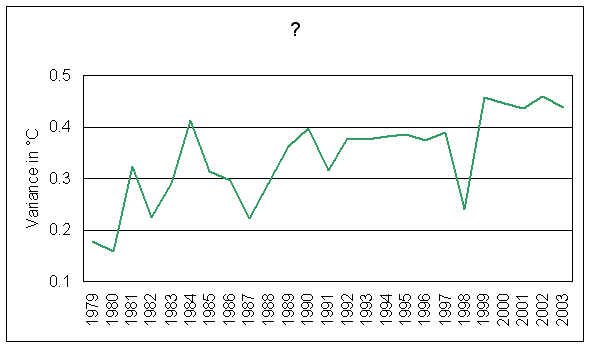
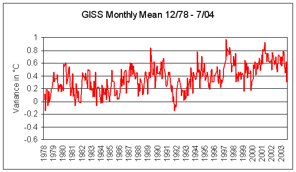
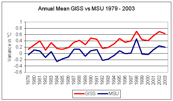
To return to our Pop Quiz, what has all the above got to do with our unlabeled graphs? Nothing... and everything. Firstly, our mystery graphs are not representations of the GISS dataset, which plotted over the same timeframe as our MSU graphs looks like this for the monthly mean:
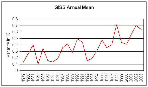
and annual mean:
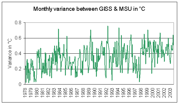
For the sake of those whose graphic memory is, um... challenged, here's the two datasets compared on common graphs:

and:
So, have you worked out what these represent yet?
Having the chart titles should help:
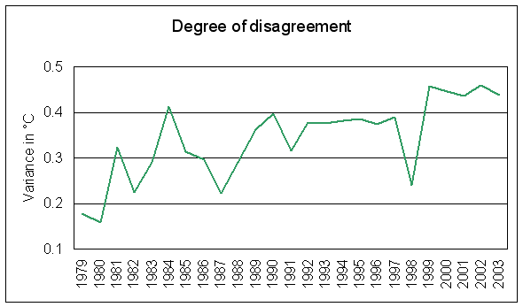
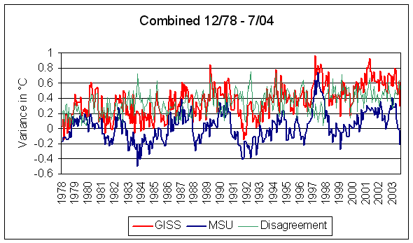
Of course! They are the growing disparity between the MSU dataset and the GISS near-surface temperature amalgam. Here they are on common graphics:
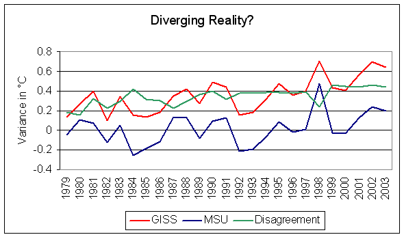
There we have it. A disagreement that makes the whole 'global warming' thing so contentious for us. Theoretically, the atmosphere should warm and cause increasing surface warming - that's the enhanced greenhouse hypothesis - but here we can see a validated dataset that indicates no consistent atmospheric warming in concert with increasing CO2 and negligible warming over a quarter-century. In contrast, we have a suspect near-surface dataset, corrupted by increasing urbanization and UHIE, with a disparity of about +0.45C (~0.8F) - except when the lower troposphere reacted to a strong warming event - the powerful El Niño of 1997/98.
Should we conclude that both the MSU and balloon-sonde datasets are broken and the increasingly-urbanized near-surface dataset is correct or vice versa?
General Circulation Climate Models (GCCMs) are not 'validated' against MSU or balloon-sonde data but rather near-surface amalgams like GISS, a dataset guesstimating almost a half-degree high in less than 25 years - is it any wonder they generate bizarre 'storylines' suggesting runaway warming sometime in the future?
Here's another pop quiz: three datasets derived by highly-diverse methods produce two widely-divergent results. Two mutually validating datasets are in virtually indistinguishable accord and suggest no problem while a third dataset with recognized problems suggests otherwise. Do we: a.) take no precipitous action because we suspect the mutually-validating datasets might be correct or; b.) destroy the world economy and lock billions of third world residents into a life of poverty on the strength of a third, already suspect dataset?
We don't think that's a particularly tough call.
Copyright © 2004 JunkScience.com - All Rights Reserved.