|
|
JunkScience.com
November 29, 2004
One of the items regularly brought to our attention here at JunkScience.com is the Common Sense Climate Index. Plastered across the index page of which is the following graphic:
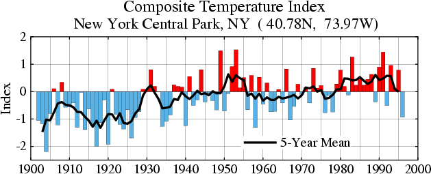
It's unequivocal - New York's Central Park is heating up, right... or not? Perhaps it's just Fifth Avenue thinking.
Here's the NYCP station data:
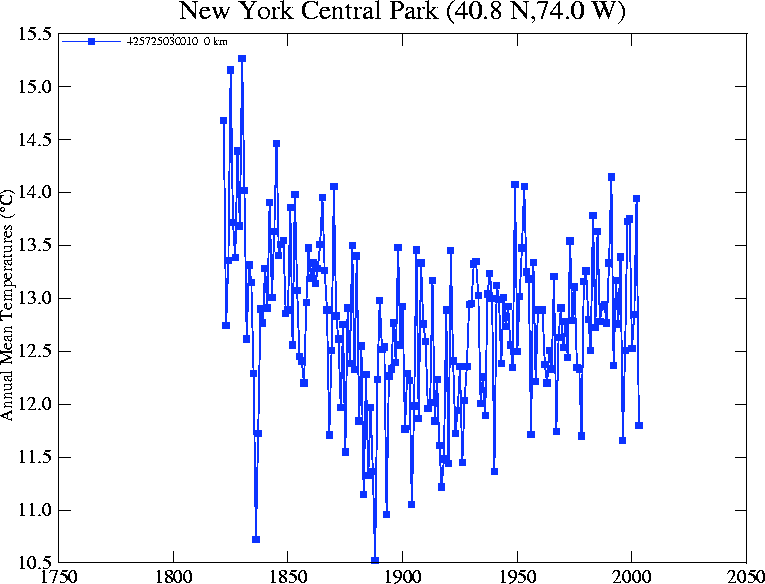
Hmm... maybe that should be "warming, relative to when?" Following are the "climate index" and seasonal temperature tracks for the same period.
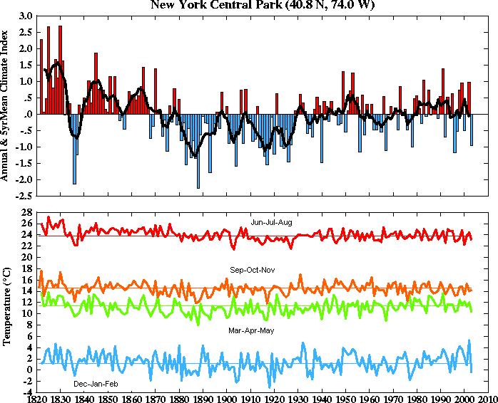
Interesting what that extra 80 years of perspective can do for graphed impressions isn't it? Two graphs, same place, covering the same period and yet one suggests the Big Apple to be a warming place while the other, with its longer perspective, suggests the "heart" of the Big Apple has indeed grown colder.
It seems New York City has grown warmer by graph design but not in fact, which makes us wonder about the "common sense climate index." What is the value of an index giving a completely false impression? Who benefits? Oh, silly us... it is, of course, the common nonsense climate index, impressions of dramatic warming by design - brought to you by the feverishly active global warming industry.
This foolish game grows ever more tedious.
Copyright © 2004 JunkScience.com - All Rights Reserved.
This article, including graphics, may be reprinted in full or in part with attribution.