|
|
JunkScience.com
November 12, 2004
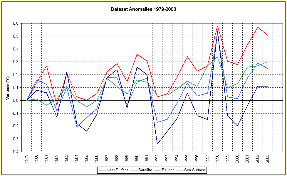
The question often arises as to why we are so particular about specifying datasets, skeptical of some while more tolerant of others - perhaps this will help. Plotted on the graph linked via the adjacent thumbnail are four temperature anomaly tracks: GISTEMP near-surface; MSU lower-troposphere (a.k.a. "satellite") - both as noted and linked above; Radiosonde "balloon" 850-300 mb (approx 1,000-10,000mtrs) from J. K. Angell, NOAA Air Resources Laboratory, September 2004 and; NCDC Sea Surface Temps. NOTE THAT THESE TRACKS HAVE BEEN 'COMMUNIZED' (ADJUSTED TO ZERO AS A BASELINE 1979).
Supplemental Nov. 15: Click here for an alternate representation showing trend lines - note well that the trend lines are also zero-anchored.
Because you asked (repeatedly): 'Communized' I wrote and 'communized' I meant - as in: "To subject to public ownership or control." Why? Because each dataset has been subjected to central planning and arbitrarily adjusted to meet a zero commencement value beginning 1979. Without mentioning any names (to protect mono-browed conspiracy theorists), no, so-adjusting entire series does not alter the trend demonstrated in any given series - click here for a chart of the original and adjusted GISTEMP annual means with [gasp!] parallel trend lines.
For individual (unadjusted) tracks and trends, beginning with the well-mixed atmosphere where enhanced greenhouse should theoretically manifest itself, click here: Radiosonde Balloon; Microwave Sounding Unit; Sea Surface Temp.; GISTEMP Near-Surface. -- Ed. Nov. 15
While all these techniques of 'taking the Earth's temperature' are in rough synch the anomalies are common only during El Niño-driven temperature peaks (most obvious in 1998). Most reactive (and least far from its 1958-1977 average baseline) is the radiosonde track, our physical measure of the well-mixed atmosphere at +0.11 °C - not global but dispersed and less subject to local corrupting influences than are near-surface measures. In ascending order of anomaly we have the MSU track, with near-global coverage it indicates approximately +0.01 °C/year increment (+0.248 °C from 20 year average over 25 years) and is least subject local disturbances. Then we have the sea surface measures at +0.3 °C - useful for short-term meteorology but quite subject to varied wind influences (rapid diurnal warming at surface when becalmed, evaporative cooling... and all at very shallow depths (millimeters) - current satellite-mounted infrared sensors do give coarse information suitable for weather forecasting but are little better than the old 'bucket over the side and dunk the thermometer' data gathering of 50 years ago. At the top of the anomaly range and galloping away from the field we have the near-surface amalgam indicating +0.506 °C (from 1951-1980 mean). That these sets measure anomalies from different baselines is irrelevant since we are only interested in the cumulative variance since 1979.
So, four datasets, four different answers, although all in the positive range. Our two measures of the well-mixed atmosphere indicate some warming, which could lead to as much as +1 °C temperature increment over a century if the trend were to continue (not very worrying). While a little rudimentary and not well suited to measuring subtle climatic trends the sea surface temps roughly concur with the MSU set. And then we have our anomalous near-surface set, beset by problems of increasing urbanization of data collection, urban heat island effect and a growing disparity with data collected with the other measuring techniques indicating an increasing rate of warming.
Is the world heating unnaturally? Depends on which data you look at and what weight you give it, doesn't it? We highlight the MSU data because we believe it the most reliable.
Copyright © 2004 JunkScience.com - All Rights Reserved.
This article, including graphics, may be reprinted in full or in part with attribution.