|
|
JunkScience.com
September 19, 2004
Updated January 15, 2005
This past week has seen significant media coverage of UK Prime Minister Tony Blair's 'global warming' fears. (UK: PM'S ENVIRONMENT SPEECH [Press briefing]; UK: PM Speech on Climate Change [Text of speech] (Number 10)) We might wonder what makes him so fearful.
To establish whether Mr. Blair is suffering relatively local warming is not too difficult since we have Hadley Centre for Climate Prediction and Research's Central England Temperature record (CET) [Data file since updated to February, 2004, updated graphic linked below]:
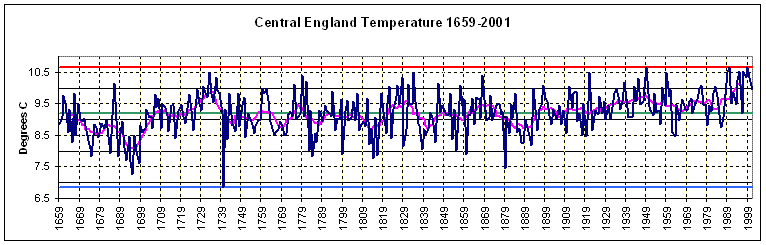
The above graph indicates by color the Annual Mean Temperature ; 10-year Running Mean ; Series Maximum Value (10.63 °C) ; Series Minimum Value (6.84 °C) and; Series Mean (9.19 °C) .
The most impressive warming evident occurred from the 1690s through 1730s with the running mean climbing almost 2 °C! We imagine that was a significant relief in the depths of the Little Ice Age although 1740 was obviously a bummer. Abrupt warmings also occurred in the 1770s; 1810s/20s; 1890s and 1990s. Abrupt coolings are evident and a relatively sustained warming in the first half of the Twentieth Century. With our 10-year running mean showing warmer than the series mean for almost the entire Twentieth Century it is fair to say there has been a net warming over the record period. Some argue that warming is a problem and we will not dwell on our contention that warming is distinctly preferable to cooling.
 Update, January 15, 2005:
This thumbnail links to an updated graphic produced in response to a truncated graph issued by the UK's National Statistics. While the reference to NatStat's truncated graph is out of context here the extension of the graphed dataset to include 2002 and 2003 may be of value. Thanks to Charles Young for noting that the graph above no longer represents the entire available dataset. Series maximum and minimum values are unchanged while series mean (1659-2004) is now 9.20 °C.
New link for Hadley Centre's data file is: http://www.met-office.gov.uk/research/hadleycentre/CR_data/Daily/HadCET_act.txt which, at time of writing, now includes to December 2004. End update. --Ed.
Having established that there has been a warming and avoided the question of whether this constitutes a problem, the next and obvious question is: "why has this occurred?"
Tony Blair appears convinced by the enhanced greenhouse hypothesis but atmospheric CO2 levels do not fit changes in the CET at all well. For example, from 1695 to 1733, the annual mean temperature rose from 7.25 °C to 10.47 °C at a time when there was negligible change in atmospheric CO2 - the running mean did not return to such readings until the 1990s. On the other hand, annual mean temperatures fell from 10.62 °C in 1949 to 8.47 °C by 1963, a period when atmospheric CO2 levels were measurably rising. Greenhouse does not appear to be exerting a strong influence on the CET.
If not greenhouse then what? Certainly there has been significant urbanization - with the English population rising from about 9 million in 1800 to almost 50 million now that is inevitable. Urbanization or at least population growth, however, has been continuously positive since the mid-17th century and that does not really suit our mean temperature track either. Or does it? Consider the effect of so many more urbanites and their fuel sources of the day - see how Roehampton University writes it up:
What is the urban effect on sunshine? This is one aspect of the region's climate that has dramatically changed over the late 19th and 20th centuries. At the height of the Industrial Revolution in the latter half of the 19th century, vast amounts of smoke and soot were emitted into the atmosphere in London. This led to the absorption or blocking of a remarkable proportion of the incoming radiation from the sunshine and hence sunshine amounts were curtailed.
It is difficult to believe today how profound this effect was and how quickly it has changed. In the 1880s, it was estimated that London was 'losing' up to 80% of its winter sunshine. In December 1890 no sunshine was recorded at Westminster. As recently as 1921-50, central London averaged only 50% of the winter sunshine as surrounding rural areas. The effect was concentrated in winter because of the increased emission of smoke and soot associated with the greater use of coal burning to heat houses and offices and also because of the low angle of the sun.
The situation is quite different today - emissions of pollutants that cause a shading effect have dropped dramatically with the switch away from coal as the prime source of energy in industry and in the home, a change well under way before the passing of the Clean Air Acts in the 1950s and 1960s. Not only has this led to a reduction in the frequency of winter smogs and fog (possibly assisted by more mobile, changeable winters in recent decades) but on occasions, central London is now sunnier than the outlying areas because of the urban heating effect evaporating low cloud or fog.
Seems plausible, a lot more people, all using what would currently be abhorred as "dirty" fuels, could conceivably generate enough smoke to interfere with solar warming, at least regionally. We are not aware that anyone seriously disputes the dramatic improvement in urban air quality over the Twentieth Century so increased solar radiation penetration to surface must at least be entertained as a probable result. Here is a mechanism by which increasing populations could influence both increase and decrease of regional temperatures and specifically where near-surface temperature readings are recorded. Importantly, it is not merely current urban heat island effect, which datasets try to address (with varying and, we think, limited success) that is affected by urbanization but, through earlier regional sunshine suppression, prior cooling (not addressed in any dataset to our knowledge) that gives the impression of current warming within the dataset. While merely an assertion rather than any form of cause and effect explanation for recorded temperature trends, the differing effect of urbanization over time highlights some of the problems with simplistic associations like enhanced greenhouse - it is not as simple as: atmospheric greenhouse gas levels have risen; recorded temperatures have risen - therefore greenhouse gases drive temperature.
There has been much discussion of solar activity recently and New Scientist published the following graph in Sun more active than for a millennium.
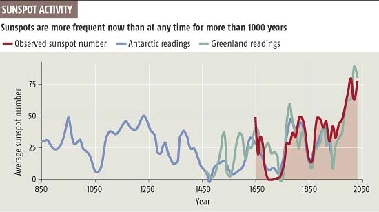
Granted, this gives us some familiar patterns, the low 1700s look reasonable, so too the high in the early 1800s and rising trend through the 1900s but hardly a great fit. Let's look at a few other graphs produced elsewhere:
Looks pretty good but...
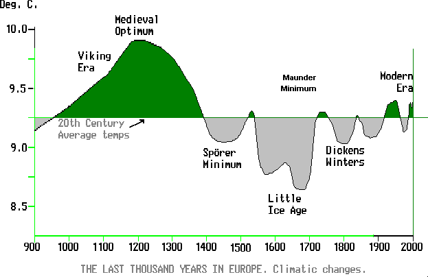
Ooh... the Medieval Climate Optimum is a bit of a spoiler isn't it. It doesn't fit either our solar activity or atmospheric CO2 scenarios - or any known combination thereof.
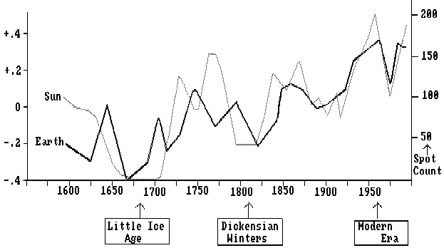
Perhaps the Danes have the answer for that, here's how John Daly wrote it up:
In November 1991, Danish scientists Eijil Friis-Christensen and Knud Lassen, startled the climatological world with a paper in Science describing a 0.95 correlation between solar cycle length and global temperature (IPCC version). Science writer, Richard Kerr described it as "one dazzling correlation"
Solar Cycle Length and Global Temperature (surface)
(The blue line is temperature, the red line is solar cycle length)
As can be seen, global temperature has tended to increase in lockstep with shortening of the solar cycle length (i.e. solar maxima becoming more frequent)
Friis-Christensen and Lassen's theory to explain this correlation was that if the time duration between solar maxima peaks was shorter, then the earth was collecting more net energy overall than if the time between maxima was longer. The cycle averages 11 years, but it does shorten to about 10 years at times, and can open out to 12 years. From the maximum of 1980 to that of 1990, the cycle was only 10 years, resulting in the 1980s collecting greater warmth from the Sun than would be usual for other cycles.
Where the maxima are very large ones, as in the last 4 cycles, then a shortening in the time duration between maxima will increase the long-term energy input into the earth-atmosphere system.
Tony Blair seems to have fallen into the old post hoc, ergo propter hoc (it happened after, so it was caused by) trap. Do global temperatures react to recent increases in atmospheric greenhouse gasses? Quite possibly but temperatures obviously respond to other influences, possibly much more so than atmospheric CO2. From what we can see, GHGs are a poor fit with measured global near-surface temperatures, so, too, are simple urbanization and sunspot numbers, although length of solar cycle appears to have promise as a primary driver.
Whatever is finally discovered to be the case, simplistic notions about greenhouse gasses appear to fit the post hoc fallacy far better than they do global temperature. Some of the things so briefly discussed here might be drivers of global temperature but hardly in isolation. As the source of global warmth, the sun, and its various phases, looks a likely culprit as a primary driver of global climate, as do the Earth's orbital eccentricities.
On reflection, having the CET show the 1990s just barely eclipse annual mean temperature recorded in 1733 (a 266 year-old record following a temperature climb of ~3.25 °C in under 4 decades, a rise which would cause pandemonium today), suggests negligible warming over two and one-half centuries, despite massive population increase, urbanization and clearer skies allowing greater solar radiation penetration to ground.
We freely admit cherry picking some of the dates used for comparison here - and why not, the greenhouse industry is shameless in their selective use of data - our purpose is to demonstrate that there's really nothing new under the sun.
A favorite comparison is the temperature increase since 1880 (roughly the end of the Little Ice Age) and that's fine. The CET above certainly indicates an annual mean increase of ~1.6 °C 1880-1999 - half that observed 1695-1733. Twice the warming occurred over one-third the time and this was before humanity could possibly have significantly influenced the greenhouse gas balance in the atmosphere, so why the current panic over possible warming and specifically over atmospheric CO2?
To return to our original point, Tony Blair has made much of enhanced greenhouse and global warming - the Central England Temperature record suggests his fears are groundless. You can either believe a 340-year temperature record or a politician - suit yourself.
See also Days of Sunshine by John L. Daly;
Heat Wave in Europe: The Mystery Unveiled by Eduardo Ferreyra
Copyright © 2004 JunkScience.com - All Rights Reserved.
This article, including graphics, may be reprinted in full or in part with attribution.