Michael Mann: Defamed or defined by “Hide the decline”?
Compiled by JunkScience.com
Introduction
Soon after the Climategate scandal broke in November 2009, Minnesotans for Global Warming (M4GW) produced and posted on YouTube a video satire, entitled “Hide the decline.” The video parodies an excerpt from the Climategate e-mails in which the University of East Anglia’s Phil Jones states,
I’ve just completed Mike’s Nature trick of adding in the real temps to each series for the last 20 years (ie from 1981 onwards) amd (sic) from 1961 for Keith’s to hide the decline.
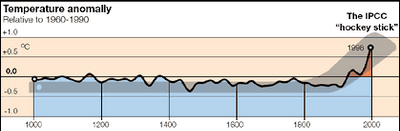
The “Mike” referred to by Phil Jones is Penn State University’s Michael Mann who is credited with developing the so-called “hockey stick” graph which purports to represent mean global temperature changes over the past one millennium. The hockey stick graph has been both central to the debate over manmade global warming and controversial. While the hockey stick was featured prominently in the Intergovernmental Panel on Climate Change’s Third Assessment Report (TAR, 2001), it was largely omitted from the IPCC’s Fourth Assessment Report (AR4, 2007).
Sung to the tune of “Draggin’ the line” (by Tommy James and the Shondells), the lyrics to “Hide the decline” are as follows:
Makin’ up data the old hard way,
Fudgin’ the numbers day by day,
Ignoring the snow and the cold and a downward line
Hide the decline (hide the decline).Michael Mann thinks he so smart,
Totally inventing the hockey stick chart,
Ignoring the snow and the cold and a downward line,
Hide the decline (hide the decline).Cli-mate-gate, I think you have sealed your fate,
I hope you do a lot of time
Cuz what you did was such a crime
Hide the decline (hide the decline).The tree ring data was very thin,
You should of chopped more trees instead of hugging them,
Ignoring the snow and the cold and a downward line,
Hide the decline (hide the decline).Cli-mate-gate, I think you have sealed your fate,
I hope you do a lot of time
Cuz what you did was such a crime
Hide the decline (hide the decline).
In a letter to M4GW from an attorney, Mann claims that “Hide the decline” defames him. This analysis considers whether Mann’s assertion is true.
Origins of the hockey stick
In 1990, the IPCC published its First Assessment Report (FAR) containing this representation of Earth’s recent climate history:
FAR page 202, graphic 7c (IPCC, 1990)
This graph did not well suit those crusading against manmade emissions of greenhouse gases as they wished to claim the current apparent warmth was “unprecedented,” and therefore, by circumstantial inference, driven by human action.
In 1995, University of Oklahoma geoscientist David Deming reconstructed North America’s historical temperatures from borehole data.[1] One of the more important players, (widely believed to be Jonathan Overpeck [2] and which has never been denied [3]), subsequently sent Deming an email that said,
“We have to get rid of the Medieval Warm Period.”
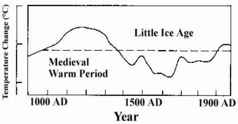
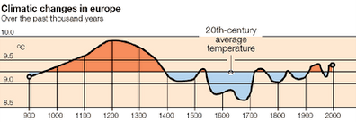
The Medieval Warm Period is believed to have been warmer than current temperatures. Obviously, this apparent warmth was not caused by manmade emissions of greenhouse gases.
Despite the expressed concerns of those desirous of attributing current warmth to human activities and the problem posed by the Medieval Warm Period, the IPCC maintained the warming in its Second Assessment Report as follows:
But by the IPCC’s Third Assessment Report (TAR) in 2001, things had changed somewhat.
Mann, the lead author of the TAR chapter entitled, “Observed Climate Variability and Change”,[4] was able to prominently feature his revision of climate history in which the Medieval Warm Period vanished to make current temperatures warming seem unprecedented.

The “hockey stick” graph as published in IPCC TAR (Figure 2-20, 2001)
And just in case readers didn’t get the desired message other images proliferated with helpful overlay shadows suggesting the world had been “normal” for most of the millennium, with dramatic warming during the industrial era.
This is where Michael Mann, in association with Raymond Bradley and Malcolm Hughes became so very helpful to the cause and somewhat notorious, since it is their publications on which this remarkable transformation is based.[5]
Did the FAR and SAR just imagine the Medieval Warm Period?
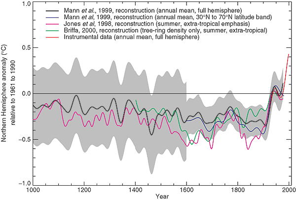
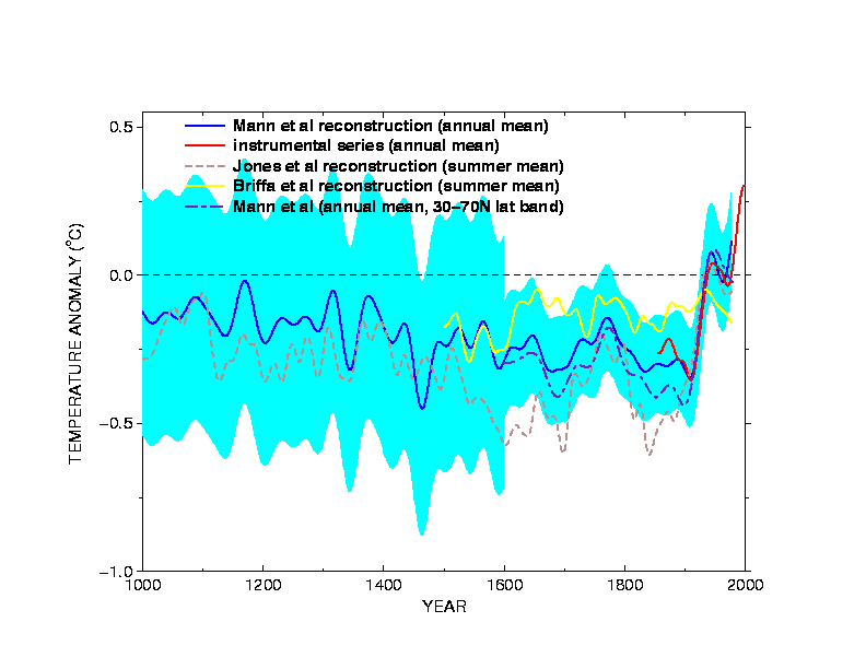
There are, of course, plenty of climate reconstructions that disagree with Mann’s.
Interactive map here: http://pages.science-skeptical.de/MWP/MedievalWarmPeriod.html
It should also be noted that societal histories ranging from Chinese Dynastic records to Viking Sagas, European trade records and tax histories all feature periods of warmth, when human societies flourished, and colder periods, when crops failed and humans suffered severe privation.
Mann’s revisionism successfully flew in the face of history but it is the "hockey stick" that is demonstrably incorrect. It is simply an artifact of Mann-ian 'statistics' and dodgy data.[6]
Recently we have seen the Oxburgh Report [7] charitably state:
Although inappropriate statistical tools with the potential for producing misleading results have been used by some other groups, presumably by accident rather than design, in the CRU papers that we examined we did not come across any inappropriate usage although the methods they used may not have been the best for the purpose. It is not clear, however, that better methods would have produced significantly different results. ... (Dendroclimatology, item 3)
With very noisy data sets a great deal of judgement has to be used. Decisions have to be made on whether to omit pieces of data that appear to be aberrant. These are all matters of experience and judgement. The potential for misleading results arising from selection bias is very great in this area. It is regrettable that so few professional statisticians have been involved in this work because it is fundamentally statistical. ... (Dendroclimatology, item 6)
and conclude:
We cannot help remarking that it is very surprising that research in an area that depends so heavily on statistical methods has not been carried out in close collaboration with professional statisticians. Indeed there would be mutual benefit if there were closer collaboration and interaction between CRU and a much wider scientific group outside the relatively small international circle of temperature specialists. (Conclusions, 2)
More succinctly then, dendroclimatology depends heavily on data selections made by the researchers, with very great potential for misleading results due to selection bias, is heavily statistical in nature, dendroclimatologists are not professional statisticians and their results are significantly skewed because they do not use the best statistical methods.
Talk about damning with faint praise! And this was from a rushed “investigation” by a tame and very friendly committee.[8] Wonder what a bad report card would say?
Specifically about Mann, Professor David Hand,[9] head of the Royal Statistical Society said [10] that the research led by US scientist Michael Mann would have shown less dramatic results if more reliable techniques had been used to analyze the data.
Did the Medieval Warm Period really exist?
Forestry expert and mathematical ecologist Craig Loehle, for example, published a reconstruction restoring the Medieval Warm Period and which suggests that our thermometer records are based in the coldest period of the last 2,000 years, relative to which we are warming. Loehle’s reconstruction relies on diverse subsets of proxies that produce similar results. This suggests that his reconstruction is quite robust.
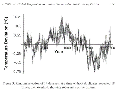
Loehle’s reconstruction, actually multiple reconstructions overlaid, clearly indicates that prior warm period and does so without reliance on any individual or set of proxies.
In contrast, Mann’s “hockey stick” reconstruction fails without the inclusion of the unique bristlecone pine tree ring series.[11]
What is the “hockey stick debate” all about?
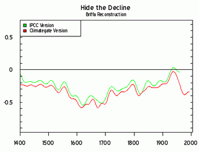
As is evident from the graphs below, Mann’s hockey stick graph (represented by the line labeled as “IPCC 2001-2003”) creates the illusion of manmade global warming.[12]
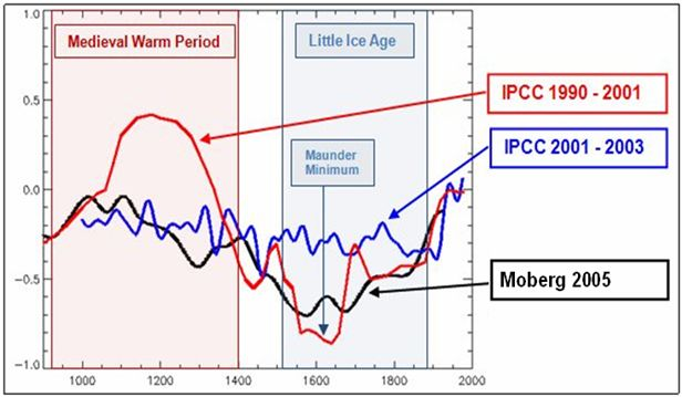
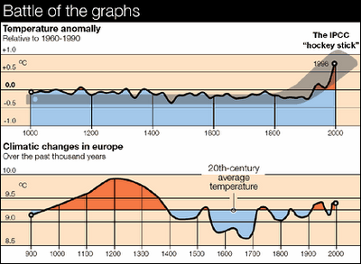
The disappearing Medieval Warm Period and Little Ice Age in IPCC reports
In his engaging April 4, 2005 presentation, Ross McKitrick summarizes the debate over the hockey stick as follows:
The hockey stick debate is about two things. At a technical level it concerns a well-known study that characterized the state of the Earth’s climate over the past thousand years and seemed to prove a recent and unprecedented global warming. I will explain how the study got the results it did, examine some key flaws in the methodology and explain why the conclusions are unsupported by the data. At the political level the emerging debate is about whether the enormous international trust that has been placed in the IPCC was betrayed. The hockey stick story reveals that the IPCC allowed a deeply flawed study to dominate the Third Assessment Report, which suggests the possibility of bias in the Report-writing process. In view of the massive global influence of IPCC Reports, there is an urgent need to bias-proof future assessments in order to put climate policy onto a new foundation that will better serve the public interest.[13]
For more in depth information and links to investigations readers should try The Wegman and North Reports for Newbies.[14]
‘Mike’s Nature trick’ and ‘Hiding the decline’
So is eliminating the Medieval Warm Period Mann’s “Nature trick” and his “hiding the decline” in mean global temperature from a previously warmer period? Not at all — it’s just a brief history — the beginning of a pattern? — of his dubious use of data.
The Climategate phrases “Mike’s Nature trick” and “hide the decline” leapt to prominence when exposed by the leak of University of East Anglia’s Climatic Research Unit Freedom of Information archive.
The quotes are in this e-mail from Phil Jones:
Dear Ray, Mike and Malcolm,
Once Tim's got a diagram here we'll send that either later today or
first thing tomorrow.I've just completed Mike's Nature trick of adding in the real temps
to each series for the last 20 years (ie from 1981 onwards) amd from
1961 for Keith's to hide the decline. Mike's series got the annual
land and marine values while the other two got April-Sept for NH lan
N of 20N. The latter two are real for 1999, while the estimate for 1999
for NH combined is +0.44C wrt 61-90. The Global estimate for 1999 wit
data through Oct is +0.35C cf. 0.57 for 1998.Thanks for the comments, Ray.
Cheers
Phil [Emphasis added]
What decline is Jones referring to and how does “Mike’s Nature trick” hide it?
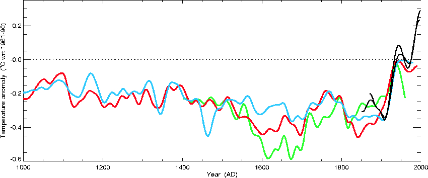
In November of 1999 Phil Jones was working on a cover chart for a forthcoming World Meteorological Organization report. In the above e-mail, Jones was informing Mann and his hockey-stick paper co-authors that he had used their trick on Mann’s temperature reconstruction at the same 1980 cutoff as MBH98,[15] but found it necessary to use 1960 as the cutoff on the Briffa series. The graph on the cover would incorporate one reconstruction of his own plus one each from Mann and Keith Briffa. Below is the original reconstruction, with the three proxy and one measured temperature (black) series intact:
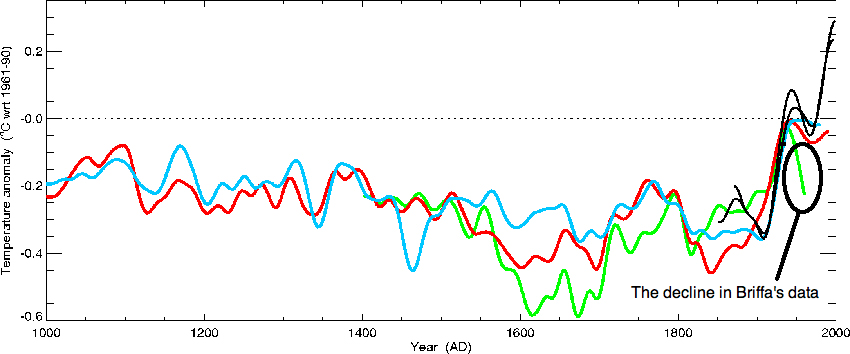
Notice how Briffa’s series (green) begins to trend sharply downward around the mid-20th century. Jones’s series (red) soon follows, but less sharply, and then it begins to trend higher. Mann’s (blue) appears to flatten out around the same year that Jones’s begins to fall. Meanwhile, all three have broken with the thermometer-measured rising temperatures of the late 20th Century. Now take a look at the chart actually published by the WMO, with all three proxy series having been surreptitiously subjected to “Mike’s Nature trick”:
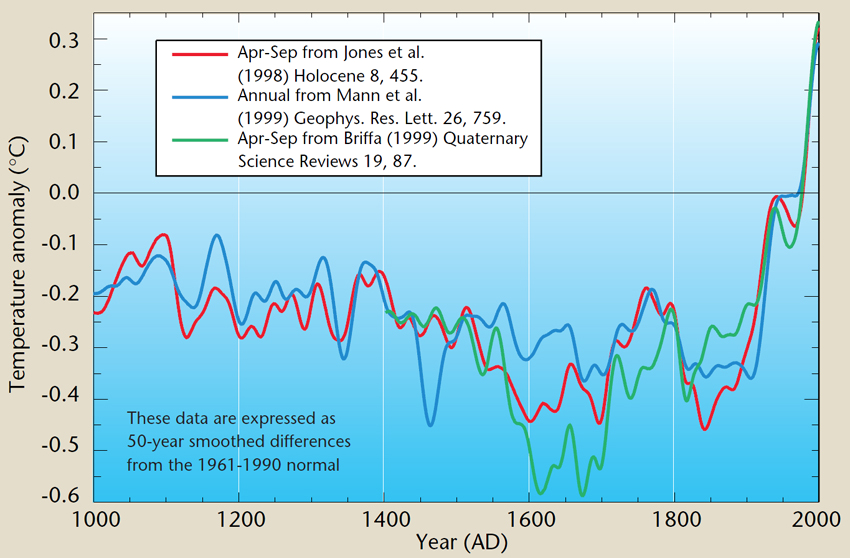
Note how the dramatic “divergence” of three reconstructions disappears along with the distinguished thermometric record. The (mis) impression given is that all the time series indicate that dramatic warming has occurred.
Note further that Jones’s e-mail explicitly states:
I've just completed Mike's Nature trick of adding in the real temps to each series for the last 20 years (ie from 1981 onwards) amd (sic) from 1961 for Keith's to hide the decline. [Emphasis added]
Yet in a response to this comment on RealClimate.org Mann says:
[Response: No researchers in this field have ever, to our knowledge, "grafted the thermometer record onto" any reconstruction. It is somewhat disappointing to find this specious claim (which we usually find originating from industry-funded climate disinformation websites) appearing in this forum. Most proxy reconstructions end somewhere around 1980, for the reasons discussed above. Often, as in the comparisons we show on this site, the instrumental record (which extends to present) is shown along with the reconstructions, and clearly distinguished from them (e.g. highlighted in red as here). Most studies seek to "validate" a reconstruction by showing that it independently reproduces instrumental estimates (e.g. early temperature data available during the 18th and 19th century) that were not used to 'calibrate' the proxy data. When this is done, it is indeed possible to quantitatively compare the instrumental record of the past few decades with earlier estimates from the proxy reconstruction, within the context of the estimated uncertainties in the reconstructed values (again see the comparisons here, with the instrumental record clearly distinguished in red, the proxy reconstructions indicated by e.g. blue or green, and the uncertainties indicated by shading). -mike]
The problem however is that Jones’ WMO preparation no longer looks like this:
Notice also that the graphic containing “three proxy series and the thermometric record” now has five apparent time series giving the illusion of rising proxy series (none of which exist in reality). The thermometer-measured temperature series was simply appended to all proxies in the WMO cover graphic, not distinguished as Mike claims.
So, is this the only piece of “decline hiding”, i.e., one WMO graphic? No. Consider the graph below from the IPCC’s TAR (2001), which is the very foundation of the famous-to-now-infamous hockey stick graph:
Did you notice the trick employed in the recent temperature history? No? Here’s a closer look:

Do you see it now?
Follow the Briffa series (in green).

Here’s how ClimateAudit describes it:
Much recent attention has been paid to the email about the “trick” and the effort to “hide the decline”. Climate scientists have complained that this email has been taken “out of context”. In this case, I’m not sure that it’s in their interests that this email be placed in context because the context leads right back to a meeting of IPCC authors in Tanzania, raising serious questions about the role of IPCC itself in “hiding the decline” in the Briffa reconstruction.
Relevant Climategate correspondence in the period (September-October 1999) leading up to the trick email is incomplete, but, in context, is highly revealing. There was a meeting of IPCC lead authors between Sept 1-3, 1999 to consider the “zero-order draft” of the Third Assessment Report. The emails provide clear evidence that IPCC had already decided to include a proxy diagram reconstructing temperature for the past 1000 years and that a version of the proxy diagram was presented at the Tanzania meeting showing the late twentieth century decline. I now have a copy of the proxy diagram presented at this meeting (see below).
The emails show that the late 20th century decline in the Briffa reconstruction was perceived by IPCC as “diluting the message”, that “everyone in the room at IPCC” thought that the Briffa decline was a “problem” and a “potential distraction/detraction”, that this was then the “most important issue” in chapter 2 of the IPCC report and that there was “pressure” on Briffa and other authors to show a “nice tidy story” of “unprecedented warming in a thousand years or more”.
The chronology in today’s posts show that the version of the Briffa reconstruction shown in the subsequent proxy diagram in the IPCC “First Order Draft” (October 27, 1999), presumably prepared under the direction of IPCC section author Mann, deleted the inconvenient portion (post-1960) of the Briffa reconstruction, together with other modifications that had the effect of not “diluting the message”.
About two weeks later (Nov 16, 1999) came the now infamous Jones email reporting the use of “Mike’s Nature trick” to “hide the decline” in a forthcoming WMO (World Meteorological Organization) report. Jones’ methodology is different than the IPCC methodology. Jones’ trick has been described in previous posts. Today, I’ll describe both the context of the IPCC version of the “trick” and progress to date in reverse engineering the IPCC trick.
Figure 1. IPCC Third Assessment Report Zero-Order Draft Figure 2.3.3a Comparison of millennial Northern Hemisphere (NH) temperature reconstructions from different investigators (Briffa et al, 1998; Jones et al, 1998; Mann et al, 1998;1999a)… All the series were filtered with a 40 year Gaussian filter. The problematic Briffa reconstruction is the yellow series.
No minutes of this meeting are available, but Climategate correspondence on Sep 22-23, 1999 provides some contemporary information about the meeting. Mann noted that “everyone in the room at IPCC was in agreement that the [decline in the Briffa reconstruction] was a problem”:
Keith’s series… differs in large part in exactly the opposite direction that Phil’s does from ours. This is the problem we all picked up on (everyone in the room at IPCC was in agreement that this was a problem and a potential distraction/detraction from the reasonably concensus viewpoint we’d like to show w/ the Jones et al and Mann et al series. (Mann, Sep 22, 1999, 0938018124.txt
IPCC Chapter Author Folland of the U.K. Hadley Center wrote to Mann, Jones and Briffa that the proxy diagram was a “clear favourite” for the Summary Policy-makers, but that the existing presentation showing the decline of the Briffa reconstruction “dilutes the message rather significantly”. (More here)
If you just look at the Briffa series in isolation, it is obvious what “hide the decline” refers to:
Defamed or defined?
So has Mann been defamed by the “Hide the decline” parody? Dr Phil Jones, Mann’s own colleague, acknowledges “Mike’s Nature trick” and explains its use to “hide the decline.”
Moreover, the accompanying documents in the leaked FOIA2009 zip archive reveal computer code written to massage data to fake warming trends. Analysis of Mann’s misuse of statistical methods and his own algorithms show his “technique” mines hockey stick shaped time series from red noise or even lists of telephone numbers.
Based on the available records, Mann seems to have knowingly employed a specific data hiding “trick” to deliver the desired outcome for a paper to be published in Nature, a trick that was then propagated throughout official United Nation’s documents and the media and which could only have deceived policymakers and the public. Does he really want a court of law to determine whether he is simply grossly incompetent or a deliberate fraud?
[1] Deming testified: “With the publication of my article in Science I gained significant credibility in the community of scientists working on climate change. They thought I was one of them…someone who would pervert science in the service of social and political causes.” (U.S. Senate Committee on Environment & Public Works Hearing Statements, 12/06/2006)
[2] While the identity of Deming’s correspondent remains uncertain, a Climategate letter from January 13. 2005, written as an instruction from Overpeck as Coordinating Lead Author to IPCC Lead Authors Briffa and Osborn (cc Jansen, Masson-Delmotte), states that Overpeck wants to “deal a mortal blow” to the MWP (and Holocene Optimum) “myths” (480. 1105670738.txt).
[3] Further discussed in “Dealing a Mortal Blow” to the MWP at Steve McIntyre’s Climate Audit here: http://climateaudit.org/2010/04/08/dealing-a-mortal-blow-to-the-mwp/
[4] Third Assessment Report (TAR), Working Group 1, Chapter 2.
[5] See Mann ME et al, Nature, Vol 392;23, April 1998 (MBH 1998).
[6] ClimateAudit.org has a page of links to relevant documents and information.
[7] Report of the International Panel set up by the University of East Anglia to examine the research of the Climatic Research Unit: http://www.uea.ac.uk/mac/comm/media/press/CRUstatements/Report+of+the+Science+Assessment+Panel
[8] See, e.g., Oxburgh’s Trick to Hide the Trick: http://climateaudit.org/2010/04/14/oxburghs-trick-to-hide-the-trick/
[9] http://www3.imperial.ac.uk/people/d.j.hand
[10] 'Climategate' scientists criticised for not using best statistical tools: http://www.telegraph.co.uk/earth/environment/climatechange/7589715/Climategate-scientists-criticised-for-not-using-best-statistical-tools.html
[11] Readers are also referred to the two-part exposé written by Marcel Crok and published in the Financial Post:
Breaking the hockey stick -- The famous graph that supposedly shows that recent temperatures are the highest in a thousand years has now been shown by careful analysis to have been based on faulty data.
The articles are excerpted from Natuurwetenschap & Techniek, a Netherlands science journal and were translated by Angela den Tex. They are no longer available from the original source and have been archived at JunkScience.com
[12] Moberg is another temperature reconstruction from tree-ring data.
[13] Full text: http://www.uoguelph.ca/~rmckitri/research/McKitrick-hockeystick.pdf
[14] See http://climateaudit.org/2007/11/06/the-wegman-and-north-reports-for-newbies/
[15] Mann ME et al, Nature, Vol 392;23, April 1998 (MBH 1998).